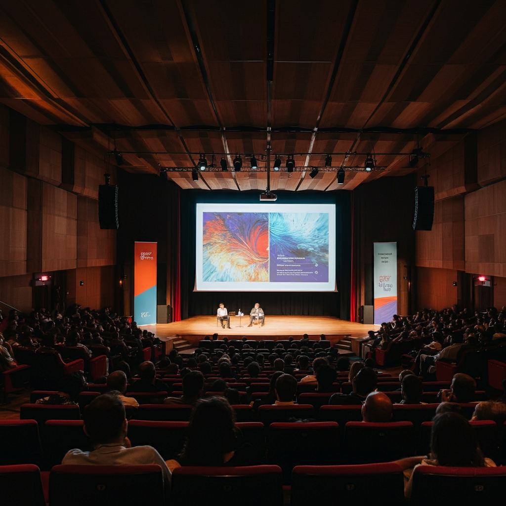
In order to properly display your content on our screens — whether you are employing traditional projectors or an LED wall — here are some tips.

Optimizing Content for Projection Screens at Live Events
Creating visuals for projection screens at live events requires careful planning to ensure clarity, impact, and smooth display. Here’s a guide to optimize your event content for projection screens, focusing on maintaining high visual quality for a seamless audience experience.
1. Aspect Ratio: 16:9 is Key
For most modern event projection systems, the 16:9 aspect ratio is the standard. This widescreen format is visually engaging and ideal for presentations, videos, and other content. Ensuring all graphics, videos, and slide decks adhere to this aspect ratio prevents awkward resizing or letterboxing, keeping the visual flow professional and clean.
2. Go Large with Fonts on Slide Decks
When it comes to slide decks, readability is paramount. Here’s a quick guide to ensure fonts are visible from every corner of the room:
- Font Size: Aim for a minimum of 24-28 points for body text and at least 36-44 points for headings.
- Font Style: Choose bold, sans-serif fonts (like Arial, Helvetica, or Calibri) for maximum clarity. If you must use unique or rare fonts, please include the font files in your email to us with your slide deck.
- Color Contrast: Use high-contrast color combinations (such as white text on dark backgrounds) to enhance readability, especially in dimly lit event spaces. Darker backgrounds are usually better than lighter backgrounds.
3. Video Resolution: Stick to 1920×1080
When displaying video content, 1920×1080 pixels (Full HD) is the standard for clear and sharp visuals. This resolution matches most projection capabilities, ensuring smooth playback and avoiding pixelation. Whether you’re showing branded content, speaker intros, or recorded videos, producing in 1080p keeps visuals crisp and professional.
4. Designing for Brightness and Contrast
Event venues often have varied lighting, which can affect screen visibility. Here are a few tips:
- Avoid Overly Light or Dark Slides: Balance color intensity to prevent washout or eye strain.
- Test Brightness Levels: If possible, test content under real event lighting to make adjustments.
- Simple, High-Impact Design: Limit slides to essential information and visuals. Overloading slides with text and images can overwhelm and distract.
5. Content Format and File Type
- Slide Decks: PowerPoint, PNG, or PDF formats are usually event-friendly, as they preserve fonts and layouts well. See the section below about choosing the best format for your presentation.
- Fonts: If your presentation relies on fonts that aren’t in common usage, please include your font files with your presentation files. This is not necessary for PNG or PDF files, though.
- From Canva: If you use Canva for your presentation design, consider exporting the slides in PNG format. You are welcome to “share” your design with us, but note that sometimes this doesn’t work quite as well as downloading and sharing actual files. We may have to spend time following up with you if you share a project, and note that if you edit a project after you’ve shared it with us, it’s likely that we won’t see those edits, since we will have already downloaded and converted your presentation.
- Videos: Save videos in MP4 format for easy compatibility across most projection systems. Bitrate should be at least 25 Mbps for HD files, and 75 Mbps for 4k files.
By following these guidelines, your visuals will enhance the audience experience and ensure clarity from any seat in the venue. Make sure to test your materials ahead of time, and you’ll be ready to deliver impactful visuals that elevate your event.
This approach keeps content professional and polished while addressing the specific needs of projection setups in event settings.